A grid system divides the screen into multiple rows and columns that can be used to create various types of layouts. With Bootstrap, to set the maximum width of the page content according to the screen width, you have to use a container. All the rows and columns should be placed inside a container to ensure proper alignment and padding.
Containers
There are two types of container classes in Bootstrap: container and container-fluid. The container class is for a responsive fixed width container and is styled to appear at the center of the screen, whereas for a full width container spanning the entire width of the viewport, we use the container-fluid class, which ommits extra space on both sides. The viewport is a meta tag used to make mobile devices display the page responsively instead of trying to display them at desktop sizes. We usually write the meta tag viewport inside head section. For example:
<meta name="viewport" content="width=device-width, initial-scale=1.0">
The different widths for container class depending on devices are:
- Phone screens (less than 768 px resolution): The width of the container is the same width as the width of the screen. The suffix used by other Bootstrap classes for this container is -xs: extra small screens
- Tablet screens (between 768 px and 992 px resolution): The maximum width of the container is 750 px. The suffix used by other Bootstrap classes for this container is -sm: small screens.
- Small desktop screens (between 992 px and 1200 px resolution): The maximum width of the container is 970 px. The suffix used by other Bootstrap classes for this container is -md: medium screens.
- Large desktop screens (more than 1200 px resolution): The maximum width of the container is 1170 px. The suffix used by other Bootstrap classes for this container is -lg: large screens.
Rows and columns
Its good practice to wrap all the contents within a container and the create a row inside the container. Once the row is defined, we can start creating the columns. Bootstrap has a class row for creating rows. You have to use rows to create a horizontal group of columns, and only columns can be immediate children of rows.
Bootstrap's grid system divides the screen into columns -up to 12 in each row, although this value can be changed using LESS-. The columns resize themselves dynamically when the size of browser window changes. The classes for columns are col-xs-*, col-sm-*, col-md-* and col-lg-* depending on width of devices (where * is the grid unit width -number of columns- that the block element should have). The value of * is between 1 and 12.
For example, when we specify the class col-xs-12, it means the element should span all 12 of the available Bootstrap columns on extra small screens. If we do not specify the behaviour on larger screens, Bootstrap will span 12 columns in all types of displays.
We have to take into account that if we use classes spanning more than 12 columns in a row, the extra columns will get wrapped as a unit on the next line. Playing with this property and the different column classes for the different screen sizes, we can create a dynamic layout that adjusts to the size of device it is viewed in.
Take a look at the following code:
<!DOCTYPE html>
<html lang="en">
<head>
<meta charset="utf-8">
<meta http-equiv="X-UA-Compatible" content="IE=edge">
<meta name="viewport" content="width=device-width,initial-scale=1">
<title>Bootstrap Grid System</title>
<link rel="stylesheet" type="text/css" href="css/bootstrap.css">
<!--\[if lt IE 9\]>
  <script src="https://oss.maxcdn.com/libs/html5shiv/3.7.0/html5shiv.js"></script>
  <script src="https://oss.maxcdn.com/libs/respond.js/1.4.2/respond.min.js"></script>
  <!\[endif\]-->
</head>
<body>
	<div class="container">
		<h1>Welcome to LostInSoftware</h1>
		<p>Bootstrap Grid classes</p>
		<div class="row">
			<div class="col-md-4 col-sm-6 colum-xs-12">
				<h2>Column 1</h2>
				<p>Lorem ipsum dolor sit amet, consectetur adipiscing elit, sed
					do eiusmod tempor incididunt ut labore et dolore magna aliqua. Ut
					enim ad minim veniam, quis nostrud exercitation ullamco laboris
					nisi ut aliquip ex ea commodo consequat. Duis aute irure dolor in
					reprehenderit in voluptate velit esse cillum dolore eu fugiat nulla
					pariatur. Excepteur sint occaecat cupidatat non proident, sunt in
					culpa qui officia deserunt mollit anim id est laborum.</p>
			</div>
			<div class="col-md-4 col-sm-6 colum-xs-12">
				<h2>Column 2</h2>
				<p>Sed ut perspiciatis unde omnis iste natus error sit
					voluptatem accusantium doloremque laudantium, totam rem aperiam,
					eaque ipsa quae ab illo inventore veritatis et quasi architecto
					beatae vitae dicta sunt explicabo. Nemo enim ipsam voluptatem quia
					voluptas sit aspernatur aut odit aut fugit, sed quia consequuntur
					magni dolores eos qui ratione voluptatem sequi nesciunt.</p>
			</div>
			<div class="col-md-4 col-sm-12 colum-xs-12">
				<h2>Column 3</h2>
				<p>At vero eos et accusamus et iusto odio dignissimos ducimus
					qui blanditiis praesentium voluptatum deleniti atque corrupti quos
					dolores et quas molestias excepturi sint occaecati cupiditate non
					provident, similique sunt in culpa qui officia deserunt mollitia
					animi, id est laborum et dolorum fuga. Et harum quidem rerum
					facilis est et expedita distinctio.</p>
			</div>
		</div>
	</div>
</body>

</html
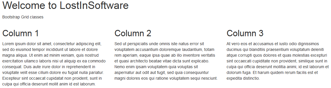
The output of the code on the desktop and large screens will be as follows:
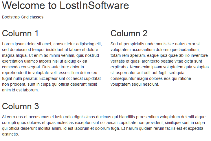
On small screen such as a tablet, the output will be as follows:
And on extra small screen such as a mobile, the output will be:
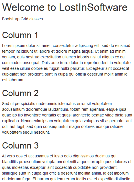
If you observe the output of the code on an extra small screen, you can see that all the columns were assigned the col-xs-12, and, as a result of that, all of them ocuppy the entire screen width. The code for small screen, the first two columns were assigned the col-sm-6 class, each of them occupies half the screen width. The third column, which was assigned the col-sm-12 class, occupies the entire screen width below the first two columns. And finally, on desktop and large screens, due to the class col-md-4, you can see that each column occupies the third part of the screen.
Offsetting, pulling and pushing columns
Offsetting is used to increase the left margin of a column, and, hence, to move columns to the right. Classes that are available for offsetting are:
- col-xs-offset-*
- col-sm-offset-*
- col-md-offset-*
- col-lg-offset-*
When you want to display columns on the screen in a different order than the way in which they are defined in the HTML code, you will use the following classes:
- col-xs-pull-* and col-xs-push-*
- col-sm-pull-* and col-sm-push-*
- col-md-pull-* and col-md-push-*
- col-lg-pull-* and col-lg-push-*
Push moves columns towards the right and pull move columns towards the left. Perhaps, the difference between push and offset is hard to undertand, but you have to know that offset uses margin-left, and push uses left. As a consequence of that:
- offset will force other columns to move
- push (and pull) will overlap other columns
Here is an example:
<div class="container">
    <h4>Normal</h4>
	<div class="row">
      <div class="col-md-2">
          <div class="well success">
            left cell
          </div>
      </div>

      <div class="col-md-2">
          <div class="well danger">
            normal center cell
          </div>
      </div>

      <div class="col-md-2 success">
          <div class="well">
            right cell
          </div>
      </div>

    </div>
</div>
<hr>
<div class="container">
    <h4>Offset</h4>
	<div class="row">
      <div class="col-md-2">
          <div class="well success">
            left cell
          </div>
      </div>

      <div class="col-md-2 col-md-offset-1">
          <div class="well danger">
            offseted central cell
          </div>
      </div>

      <div class="col-md-2">
          <div class="well success">
            right cell
          </div>
      </div>
    </div>
</div>
<hr>
<div class="container">
    <h4>Push</h4>
	<div class="row">
      <div class="col-md-2">
          <div class="alert alert-success">
            left cell
          </div>
      </div>

      <div class="col-md-2 col-md-push-1">
          <div class="alert alert-danger">
            pushed center cell
          </div>
      </div>

      <div class="col-md-2">
          <div class="alert alert-success">
            right cell
          </div>
      </div>

    </div>
</div>

You can also use offset for centering columns. For example:
<div class="row">
	<div class="col-md-4 col-md-offset-4 alert alert-success">
		<h1 class="text-center">Hello World!</h1>
	</div>
</div>

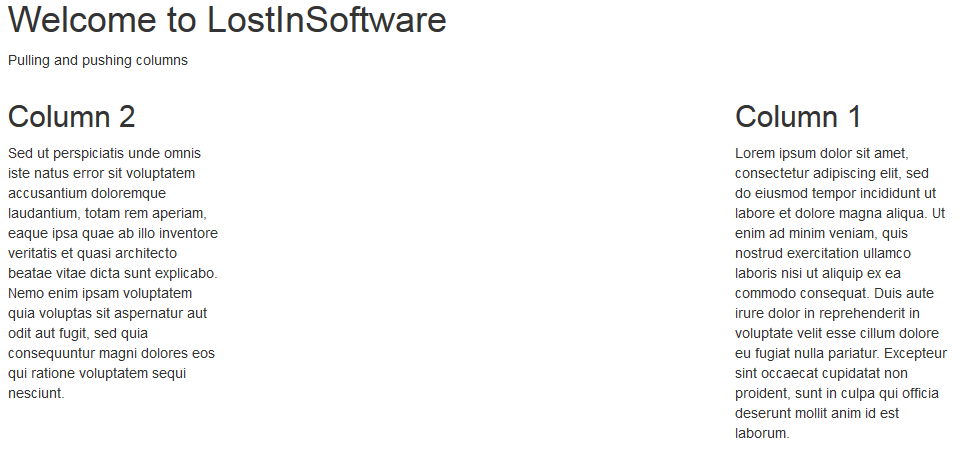
Using push and pull you can swap columns as it is shown in the following code and image:
<div class="container">
	<h1>Welcome to LostInSoftware</h1>
	<p>Pulling and pushing columns</p>
	<div class="row">
		<div class="col-md-3 col-md-push-9">
			<h2>Column 1</h2>
			<p>Lorem ipsum dolor sit amet, consectetur adipiscing elit, sed
				do eiusmod tempor incididunt ut labore et dolore magna aliqua. Ut
				enim ad minim veniam, quis nostrud exercitation ullamco laboris
				nisi ut aliquip ex ea commodo consequat. Duis aute irure dolor in
				reprehenderit in voluptate velit esse cillum dolore eu fugiat nulla
				pariatur. Excepteur sint occaecat cupidatat non proident, sunt in
				culpa qui officia deserunt mollit anim id est laborum.</p>
		</div>
		<div class="col-md-3 col-md-pull-3">
			<h2>Column 2</h2>
			<p>Sed ut perspiciatis unde omnis iste natus error sit
				voluptatem accusantium doloremque laudantium, totam rem aperiam,
				eaque ipsa quae ab illo inventore veritatis et quasi architecto
				beatae vitae dicta sunt explicabo. Nemo enim ipsam voluptatem quia
				voluptas sit aspernatur aut odit aut fugit, sed quia consequuntur
				magni dolores eos qui ratione voluptatem sequi nesciunt. </p>
		</div>
	</div>
</div>
Nesting columns
To nest colums you have to put rows and columns within an existing columns. Nested rows should include a set of columns that add up to 12 or fewer (it is not required that you use all 12 available columns).
<div class="row">
  <div class="col-md-10 alert alert-warning">
    Parent column (width 10 units)
    <div class="row alert">
      <div class="col-md-6 alert alert-success">
        Left child column
      </div>
      <div class="col-md-6 alert alert-danger">
        Right child column
      </div>
    </div>
  </div>
</div>

Less mixins and variables
Bootstrap includes Less variables and mixins to build semantic layouts.
Bootstrap Grid contains the following three LESS variables:
@grid-columns: This variable defines the maximum number of columns displayed on desktops and large screens. The default value is 12.@grid-gutter-width: It defines the width of the gutter. The gutter is the vertical space between the grid columns, which default value is 30 px.@grid-float-breakpoint: This variable is the minimum width with which the elements with the col-lg-x class start getting displayed in the columns. The default value 768 px, that is, the minimum tablet screen width.
Mixins in Bootstrap used more commonly to build semantic layouts are:
.make-row(): This mixin is used to create rows in our layouts. It clears all the CSS float declarations added to the columns wrapped in the row..make-_prefix-width-screen_-xs-column(): It is used to create columns in our layouts. It adds CSS float declarations to the columns, creates the gutters, and sets the column widths..container-fixed(): Used to create a container element centered on the page.
Other mixins are those related with pull, push and offset. You can get more information at http://getbootstrap.com/css/#grid-less
Bootstrap allows you to edit and select the features you want that should be present inside your own custom Bootstrap package. You can get more information at http://getbootstrap.com/customize/ and at http://bootstrap-live-customizer.com/.
You can get more information about Bootstrap css at http://getbootstrap.com/css/
Related Posts